Meet the new template for real estate sites – Realty Nova. The new template follows our commitment to latest trends in design, simplicity and enhanced user experience. Let us go over the new template and see how it can be used for your real-estate portal.
Different Header Options
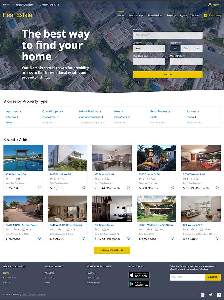
When creating the Realty Nova template, our main goal was to make the home page as simple as possible while keeping all the important elements at a user’s fingertips. We managed to do that by placing the most needed functionality in the header of the theme while keeping the main area of the website entirely for ads with no other distractions for users.
As a result, we came up with two different options besides a default header. It is a common thing to have various design alternatives when creating a template, but ultimately only one is finally chosen based on a number of votes from our team. However, in the case with the Realty Nova Theme, we couldn’t stick to one option because the two options were different and each had its own pros.
The first header option features an H1 title and a short description where you may place the information about your company. Under this option, the header content is divided into two equal parts, the left one for an H1 title and the right one for a search form.
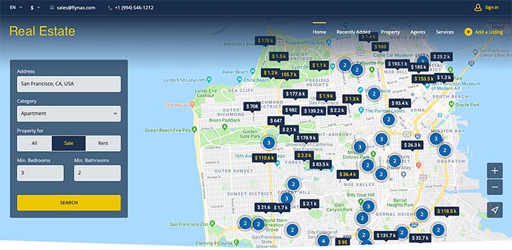
The second header option features a full-width map with a search form placed on the left. The map is not an image but a real map with listings positioned on a map as blue circles with numbers inside them representing a number of ads in a certain location. This allows a user to quickly glance at a map, locate listings in a desired location and proceed right to viewing them.
You may easily enable the desired header right in admin panel. Keep in mind, that this works only for the home page. For the remaining pages, the header stays the same and has less height allowing a user to focus on the page content.
Main Area
Just like all Nova line templates, Realty Nova keeps the main area free of plugins, filters and other boxes and gives all of its space for ads. In its maximum width of 1440px, the content area features ads in rows of 5 with the ability to load more at the bottom. The template is fully responsive and the number of ads in a row decreases based on a user’s screen width.
Listing Details page
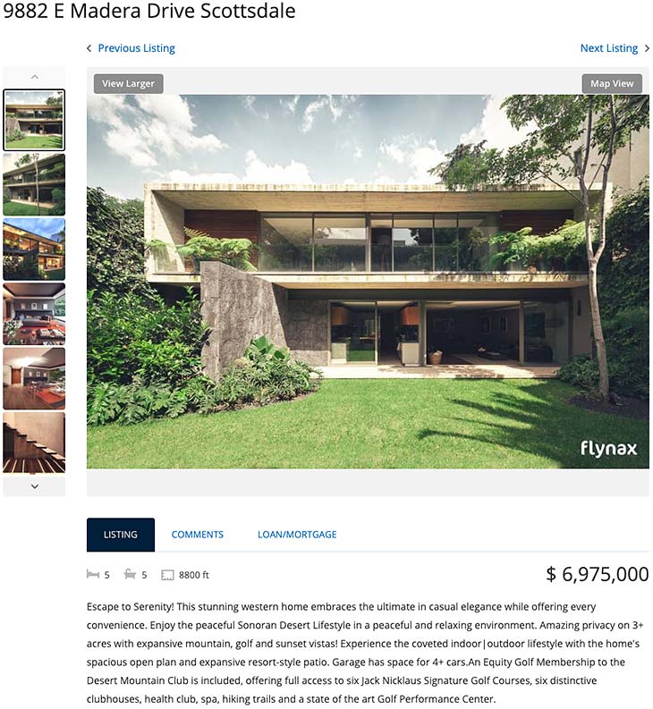
When a user lands on an ads details page, he sees the main image of a viewed ad while the remaining images are located on the left as thumbnails. We decided that a listing details page is the right area where you may showcase all the plugins, such as recently viewed, featured, mortgage calculator, filter, weather and others that you may decide to enable on your website.
Other improvements:
- Header banner under the header for an ads campaign;
- Maximum width of 1440px to cater to widescreen displays;
- Browse by property types boxes re-designed;
- Fully responsive theme looking perfect both on small and big screens;
- Better navigation and enhanced UI/UX.
You can take the new theme to a sandbox right now. It is already available on our demos.